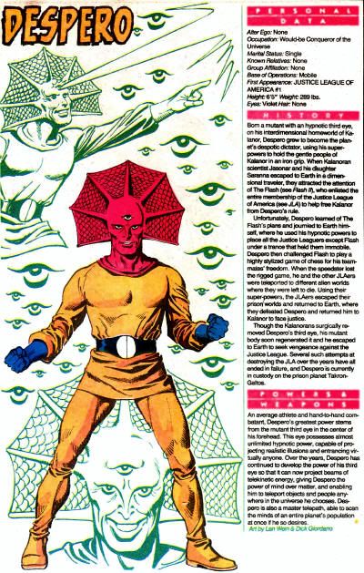
By 1985, I'd already been collecting comics for a number of years, though the closest I'd come to a comic shop was booths at flea markets. Most of my purchases were from the Marvel Comics Group, and typically off the newsstand at 7-11. I was and remain a huge fan of reference books like The Official Handbook of the Marvel Universe (Deluxe Edition, 'natch,) but I only ever saw Who's Who: The Definitive Directory of the DC Universe at bookstores like B.Dalton and Waldenbooks. My first issue was the sixth, and it was a whole different world from the Marvels I adored... a lame, weird, stupid world.
The first page of your average Marvel Handbook would feature a super hero or villain with a slick, modern design. They would be drawn by the creme of the contemporary crop in a style guide approved pose, with the glorious embellishment of Joe Rubenstein to provide a uniform standard of quality. There would be a brick of well organized text to inform you of all the basics of the character. At the bottom would be a spotlight panel taken from a previous comic, or if it was a Handbook of the Dead issue, the character's death blow. Repeat formula for something like 48-64 pages, and put a wide smile on a young geek's face.
My first issue of Who's Who opened to a boring feature on the Daily Planet offices, as drawn by that master of the bland, Curt Swan. Next, six pages of interesting futuristic characters from various sci-fi and fantasy series, all canceled before the end of the decade. Here were pin-up shots, with monochromatic backgrounds that took up too much space for there to be detailed biographical information. Deadman looked okay, but the next page was divided by two villains, a sign of disrespect that Marvel only showed to alien races and the very least distinguished members of super-teams. The Deep Six were ridiculous looking fish-insects, Deimos wore a skirt, the Demolition Team were laughable, the Demon was neutered by Kirby... when Demonia of the Omega Men is a sudden bright spot, your universe is in serious trouble. Right after DeSaad, a.k.a. old pervert in a bathrobe, was the finny idiot you see above. That's right, the pink guy with a third eye, on a page facing Destiny and Detective Chimp. Repeat for 32 pages, and prepare to be mocked by even the least sophisticated audiences. I didn't buy another issue until years later.
Despero was drawn in a rare outing by writer Len Wein, who I don't recall ever producing a script for the Kalanorian ruler. I assume inker Dick Giordano had a hand in making Despero unusually decent, while still a joke on two legs. Note that his gloves, which are normally of identical color to his outfit, are mistaken for blue. R.E. S. P. E. C. T. After a showing like this, I remained almost exclusively a New Teen Titans follower until Byrne took over Superman.
Nearly a quarter century later, and I'm still getting over all those years where I bought almost nothing but DC Comics, obsessing over Post-Crisis minutia. I now run a blog devoted to one of their B-List characters, and will spend a good chunk of a month covering one of my first examples for why I rarely bothered reading DC in my early years. I learned much later that Despero has always been a pretty solid villain, and for a long while there, quite the nemesis to the Martian Manhunter. Far more than Malefic, I see Despero as a mirror reflection of how J'onn J'onzz could have gone very wrong, and certainly more worthy of the spotlight. Don't worry though-- I couldn't fit all my Despero coverage into one month if I tried, so the blog should be pretty evenly split with Martian Manhunter. There's always next year, and the year after that, and the year after that. In truth, I need at least a half month just to keep up with my ever expanding catalog of Despero stuff to cover...









11 comments:
I grew up with DC (Curt Swan is NOT boring) but even I thought Who's Who was a sad joke compared to the Marvel Universe handbooks. At least the first couple of issues had those awesome George Perez covers.
Oh, and thanks for getting rid of that white text and black background. In brightest day, in blackest night, it put a hurtin' on my eyesight.
I'm glad Despero is getting a feature in your blog this month. I am definitely a fan, from the little I've read of him. (Thinking JLI. And that episode of the cartoon.)
He looks so happy in his encylopedia entry. It just warms my heart.
My only pet peeve with this character is that artists hardly ever draw an eye socket for his third eye. It's kind of a necesity and it just really bugs me.
I now run a blog devoted to one of their B-List characters
Who's the other blog about?!
Tom, I didn't mind the white on black so much, but my inability to easily copy post titles was a real bother.
I have an old issue of Amazing Heroes where Jim Shooter, John Byrne, and several other notables engage in a lengthy discussion about whether or not Curt Swan is boring. That speaks volumes. What is interesting is that Swan keeps company with guys like Jack Kirby and Steve Ditko in that everyone has strong feelings about their work, positive or negative. I find Swan tolerable, and sometimes appropriate, but usually a liability to my personal reading enjoyment. He's no pin-up artist, for certain.
Liss, I share your irritation with artists drawing Despero's third eye like someone painted it on his forehead at Mardi Gras or something.
I still haven't seen Despero's animated appearance.
If you want eye-popping pin-ups, Swan's not your guy. He's too subtle for that. He's great at character. He draws actual human beings with real, individual human faces -- faces capable of a range of emotions, faces that can do more than grimace. Sadly, this is a talent which makes him a rarity among comics pros and for which most comics readers have no use.
What books did Curt Swan write for? I'm not familiar with him.
Tom, that's a great point. Sometimes today you can't tell the difference between one hero to another save for their costumes. While I don't think faces need to be cariactures (though I do like that approach for villains), I'd like some unique characteristics besides hairstyle to tell heroes apart. In Flash: Rebirth, Barry and Wally look like twins, save for eye and color. Artists I think fall into the trap of drawing the "standard" or "ideal" hero far too often. One reason I loved JLI was all those over-the-top facial expressions. It really brings the charaters alive.
Frank, Despero was in the episode entitled "Hearts and Minds," which I think was in the 2nd season. It was mostly a GL-specific episode.
Tom, that's exactly my problem with Swan. He draws average, stiff, awkward, frumpy, dull looking people from the same Anglo-Saxon gene pool. It's like when Alex Ross paints the seams on super-heroes costumes, but with Phil from the office wearing the outfit instead of a proper model. Comparing Swan to Kevin Maguire is equal to comparing Sam Donaldson to George Clooney. They're both real people, but one's got a tad more charisma and animation than the other. Swan was born to draw advertising circulars for Radio Shack.
Liss, Swan was the definitive Superman and Legion of Super-Heroes artist of the 1960s. Unfortunately, Swan was still the definitive Superman artist into the mid-80s, which is why DC needed John Byrne to revamp the character or cancel the line.
That's probably because Alex Ross just grabs his neighbors and asks them to model for him, which is think is actually true.
Ah, okay. I don't really read Superman or LSH.
It's probably not a proper comparison, but Certa really drew some great mugs when it came to criminals. Looking back at Showcase, he really had a flair for outrageous faces. You don't really see that today in comics at all.
At first blush, I wasn't that impressed with Certa, but I've grown to really appreciate his work over the years. He's another artist who drew a variety of distinct faces and body types, but not in a rigid, heavily referenced way. I especially like his more fluid and expressive later work, whether the polished John Jones strips, or the more angular and sketchy House of Mystery material. Again, Swan bugs me because he seemed to lock in his singular style in the 1960s, and the only variation came from his inkers. Certa never seemed content with his work, always experimenting, tweaking characters designs, and so forth. He deserves more recognition, and by that I mean any. Compare any randomly selected page from the first Manhunter Showcase volume and another from the second half of the next volume, and look at the differences in technique. His versatility, especially in a time when consistency was so valued, is amazing.
I also like how Certa adapted his style to the changes in the stories over the years, from his detailed, atmospheric work in the early John Jones detective stories, to a more cartoony style when the focus shifted to the Martian Manhunter, to the looser style of the Idol-Head stories, and finally to the edgier Marco Xavier style.
I have to admit you make a pretty compelling case against Swan. Now would be a good time for the anonymous president of the Curt Swan Fan Club will come to my rescue.
Well, again, I like Swan on certain books and in moderation. He has his charms. For instance, I liked his work with Al Vey and Eric Shanower on Aquaman, and he could juggle a host of Legionnaires better than most. Karl Kesel was wonderful at updating Swan in their few collaborations. Swan definitely stood up to overpowering inkers better than Jim Aparo in his later years.
Post a Comment