
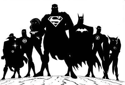
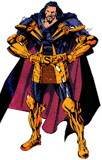
Andrés Tommy Tejeda is an Emmy-winning character designer and occasional director who has worked on most DC-related animation since the mid-90s. To help promote the Justice League cartoon, Tejeda was asked to produce this piece, which was reworked by Bruce Timm into one of the most recognizable and oft-used images from that series.
The eyes in this original are a bit sinister, so removing them was probably best. Timm also improved most of the team's stances to make them more dynamic and character specific. However, Tim's inclusion of belts for everyone is a head-scratcher, excepting Flash's lightning bolts and Wonder Woman's girdle.
On the other hand, Timm's cross-armed Batman is boring, and the appearance of the bat-symbol anatomically incorrect. I prefer Tejeda's more exaggerated and mysterious take on the Dark Knight Detective. Tejeda's 3/4 turns on Flash and Green Lantern allowed for far more distinct heads (plus wings!) than Timm's black blobs of nobody. It was smart of Timm to put Wonder Woman's hands on her hips, but Flash looks too docile in the same pose.
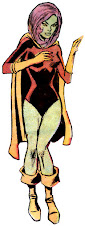
The one element that really puts Tejeda's design over the top is the use of large iconic symbols for each hero. Timm really muddied that part up, and made some alternate choices I disagree with. For instance, a lot of people have used the red "X" as a symbol for Martian Manhunter, but there's a ton of DC characters identified with crossed straps on their chest, most notably Hawkman. Ever since I bought my Super Powers Collection figure in the '80s, I've preferred the "pie" belt buckle as J'Onn's icon, which dates back to his very first appearance. Timm blew that off and bought him a Faded Glory one from Wal*Mart instead. I love the big honking Green Lantern symbol, and though Timm's stance draws attention to John Stewart's fist, nothing sells a power ring like energy emanating.
My biggest complaint about the popular version was always the sissy J'Onn J'Onzz, too skinny and just standing straight, diddling his cape. Tejeda's figure is much more impressive in breadth and stance, looking as big as his teammates instead of much smaller. Tejeda also angles the popped collar to look coolish, instead of like a child's Dracula costume.
For more by Tommy Tejeda, check out his blog, Vibrational Frequencies. I'm also having a spotlight at my blogs, so give 'em a look.
- Earth's Mightiest Heroes
- 2001 Justice League Animated Art
- 2007 Lobo verses Wolverine
- 2009 The Submariner vs. Aquaman
- 2009 Tigra versus Cheetah by Tommy Tejeda
- 2009 Warner Brothers Animation Mural in Burbank, CA
- 2010 Doctor Strange vs. Doctor Fate
- Tommy Tejeda Martian Manhunter Art Gallery
- Tommy Tejeda Wonder Woman Art Gallery


5 comments:
I like this one because of the way every characters symbols are shown.
Frank and anyone else who would answer, i have a question for you. Iam looking to buy a comic about Commander Blanx (on some sites it says Ben Blanx is that really his full name) should i buy his 1st apperence in JLA 71 Death Orbit or JLA 144 (on 144 he is on the cover)
I am aware of this "Ben Blanx" business on the internet, but have never found any supporting evidence in the comics. I suspect someone confused Blanx with B'enn B'urnzz, a fugitive green Martian from the future that appeared in an issue of Detective Comics.
Given a choice, you should buy JLofA #71. This was Blanx's first & lastish appearance, plus gave the details of his history with J'onn J'onzz. JLofA #144 is a better story, but the Martians are used to motivate a period team-up amongst DC's 1950s characters. Blanx only appeared in a few scenes that bookended the crossover chapters.
I kinda wish Tejeda went with both the X-straps and the pie symbol. Yes, Hawkman has the X-straps, but he wasn't only the cartoon. (Only in a guest appearance.) Plus, because it's a silhouette, it just seems weird to have everyone else in the picture have a chest emblem and J'onn gets a...belly button emblem? Artistically it doesn't match up right, IMHO. Maybe I'm just overthinking it. Then again, the X-straps might've looked too busy... My other pet peeve is that the energy from John's ring looks like it's emanating from J'onn's chest. Maybe GL could've been placed on the right instead of the left.
I like how Hawkgirl looks kind of angry, and how Wonder Woman turned out.
Thus ends my nitpicking. It is a really cool image, and if I had to pick one of my favorite images from the JLU it would be something along this lines. It would make a great poster.
Originally, Jemm was going to be in the JLU... ;p
Post a Comment