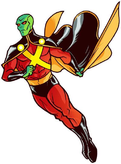
In an effort to catch up on my schedule, I wanted to spend a bit of time this week looking at the routinely "off" attempts at redesigning J'Onn J'Onzz. He's a uniquely challenging character, because his green skin really interferes with other colors, and the expectation of showing a lot of it contradicts his whole reserved, cerebral detective shtick.That having been said, it strikes me as funny how slapping him into a variation on the Pixar Incredibles family get-up actually kind of works. I often point to the use of black as cheap, and doubly so when paired with red, but the balance here is such that it comes off as vibrant with subtle contrast. Obviously the yellow adds to its pop, as evidenced by Tim Drake's (really terrible) last costume as Robin, but it works better on a more fantastical sci-fi character. It's gaudy enough to recall the Alien Atlas' pulpy origins, but refined enough that you can still buy him as a more refined figure. Finally, all three colors work for the sparse green, bringing it to the fore by minimizing its expanse. It reminds me of the Vision, in that the thing you remember most about a hero 95% covered in yellow and green is the splash of red on his little exposed face. I don't like the gauntlets, but otherwise this is strangely effective.
Savage created a whole JLA of Incredibles, and while this turned out the best of the lot, you should take a gander at the rest at Project : Rooftop.








3 comments:
I'd like it better if the cape had a traditional collar instead of the shoulder-covering part. Too Robin. Interesting. I still like the asymmetry in the design I found, though. I'd like to see someone play with asymmetry a little more.
And, hey, if this is The Incredibles: NO CAPES!
I actually like the previous one by Rob Duenas more, except the whole thing of being fireproof (that just lame).
Admittedly, this would go stale after about one Elseworlds, but its still refreshing.
Post a Comment