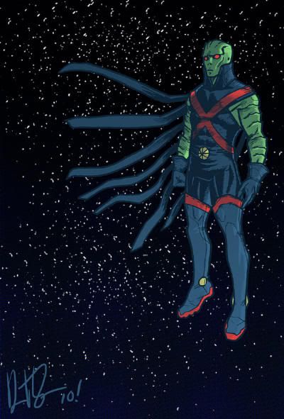
Earlier this week, when I published the post on Miss Martian art by Jemma Salume, I kept waiting for someone to follow the Project: Rooftop link and point out that there was a two week old Manhunter redesign on their front page. Since no one did, and school has got me ever eying the low hanging fruit, here's that inevitable post.
In mid-July a call rang out from P:R contributors to address “Heroes In Need”, characters that desperately needed the intervention of the fashion police. Jon Morris nominated the Martian Manhunter...
The giant green monster look works for the Hulk because they’ve kept it simple. With the Manhunter, he’s got one of everything from a flared collar to a bandolier to patriot boots, and none of it looks alien except in the sense that his culture may not have a concept of godawful eyesores. I know we’ve got one of these in the pike for the JLA Redesign, but I’d love to see MM taken on en masse.
Artist Daniel Irizarri responded with this, and given my comments on J'Onn J'Onzz's failings yesterday, the timing was spot-on. I don't especially like the look, but it definitely says "alien super-being." The barest nose, wide eyes and biological armor on the arms looks like a cross between Whitley Strieber gray alien and Gill-man. I'm already on record as being unnerved by J'Onn J'Onzz in gloves, but in this gear, an anal probe is assured. The thigh high boots really sell the fetish, and the shredded cape adds that Fosse flare (not to mention evoking the Black Lantern "hand" drape.)
On the other hand, the suit reminds me a lot of the underrated José Ladrönn One Year Later, while reincorporating much loved classic elements like the high folded collar, "pie" symbol, and the necessary exposure of Martian flesh. The red cross straps are in there too, but that's one seminal design element DC could do with less of. All in all, it isn't perfect, but it's not too bad, either. In truth, I prefer at as a piece of design art that uses isolation to convey who the character is at heart. This would be great for an Elseworlds, too.
For more, give Daniel Irizarri's DeviantArt gallery a gander.









1 comment:
This redesign does not work for me. I did not initially recognize what was on the arms as armor, and thought that they were skin folds. Also, this design is creepy. I think what J'Onn needs is an impressive look
Post a Comment