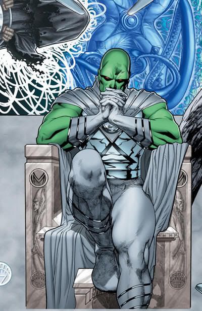
Back in June, I got all excited about what I thought was the first Martian Manhunter solo variant cover ever. In my rush of enthusiasm, I forgot to apply critical judgment, and realize artist Dave Finch was only doing the standard covers for Brightest Day. Now, DC has begun releasing variant covers featuring each of the resurrected Twelve tasked with performing labors by the White Power Entity (which never stops being hilariously wrong-headed.) Before truly being alive again, J'Onn J'Onzz must burn the Star City forest, which the Entity itself created. It's not a very exciting task, but is way better than having your second life revolve around the throwing and catching of a boomerang (which takes two undead people to accomplish!)
Anyhow, all of these White Lantern Corps covers connect to form a single cryptic image. That means web sites and message boards are buzzing to Deconstruct the Massive Biblically-Inspired White Lantern Cover Art. You know, the same way they did the two Ethan Van Sciver Countdown teasers, as well as Tony Daniels' Battle for the Cowl. Memories must be short, because not only did those mini-series suck, but the "clues" were only vaguely relevant to anything that happened in them... or worse, indicated even lousier spin-offs (see: Martian Manhunter stealth promoting the terrible Salvation Run.)
In this instance, the figures are drawn by Ryan Sook, and everyone but the Hawks are freestanding, so the placement in the collective image could be completely arbitrary. Maybe Jade is turning evil, or maybe Hawk got plugged into the wrong slot in a production department rush. Maybe Captain Boomerang being parallel to Martian Manhunter means both parties will end up in Star City, and Digger sure would make a good Green Arrow villain. However, both also line up with the Indigo Tribe compassion entity Proselyte, which is the best possible match for J'Onn, but anathema for ol' Boomerbutt (unless that's the point?) However, the entities/background was drawn by Fernando Pasarin and Joel Gomez with help from Jim Lee, so there's no guarantee the image was ever intended to interact with the foreground.
Look, it's a nice image, and when the book this cover appears on is announced, I'll note that here. I think DC should have trickled all of these out individually, or at least wait to get down to the real losers before unveiling the compete picture. That would have made more of a game of it, and given me the chance to offer more detailed information. What I will say though is that you're getting gamed if you put too much thought into what is probably another case of sizzle over steak. However, if J'Onn finds himself hooked up with Hawkgirl, that'll be a humdinger!








4 comments:
Holy cow...the lines on this are just GORGEOUS. Someone is really channeling Alphonse Mucha here. WOW. Not to mention the shading. Whoever says comics aren't art should be shown this, because this is quite impressive.
I don't think of it as biblically-inspired as Art Nouveau-inspired. This is like if-comics-existed-during-the-1920's. The only thing I enjoy about these teasers is the skill put into them and the artistic references, becuase the predictions never pan out. (Two-Face Batman? Do you know how excited I was for that?)
I like this "White Lantern" Martian Manhunter costume a lot better than the one that was in the most recent issue of Brightest Day, which didn't look right with they way they did the straps. A silver breastplate is way better.
The only thing that intrigues me is that Firestorm doesn't have a mouth. I don't know what that means. And the Hawks aren't looking at each other. And there's that little collector SallyP was talking about, sitting over Deadman.
J'onn + Hawkgirl? Well, she does have a bit of a "come hither" expression there. Too bad J'onn is too busy contemplating his next chess move to notice.
The gray and white really suits J'Onn, just like that fan piece I ran a while back. Aside from the gloves, it wouldn't break my heart to see this as a permanent costume change. The DoubleM logo isn't going to happen though.
Joe Quesada had a run of Art Nouveau riffing pieces in the '90s, including a Gambit/Rogue poster set that was hugely popular with the ladies at the time. Someone somewhere in comics is always dipping into that period.
Yeah, the muted colors give him a low-key kind of look. I didn't think I'd like gloves on him, but the silver bands on the gloves (and boots) are pretty cool.
That Quesada poster is really Nouveau. Awesome. I love seeing comic artists throw a little culture into things now and then, especially when it's not just for a showpiece. The Art Deco style of the old Batman cartoon was an inspired choice, for example.
While I really don't like the gloves, the rest of the costume is great. It has a certain elegance, subtlety and power about it.
Post a Comment