

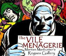
The 1980s were a "rebuilding" decade for the Martian Manhunter after sitting out the '70s. Since he spent most of the decade as a secondary character in team books, the covers reflect that, so I chose a strong top 10 over a middling 20. This did however shut out guys like George Pérez, who drew a lot of swell covers of the Alien Atlas and thirty-two other characters, which gets crowded for a hero-specific ranking.
Honorable Mentions
- Abbott & Costello Meet the Bride of Hembeck #3 (June, 1980)
- Justice League of America #200 (March, 1982)
- The Best of DC #30 (November, 1982)
- Justice League of America Annual #2 (1984)
- Justice League of America #241 (August 1985)
- Who's Who: The Definitive Directory of the DC Universe #14 (April, 1986)
- Justice League #6 (October 1987)
- Justice League International #7 (November 1987)
- Secret Origins #32 (November 1988)
- Secret Origins #35 (Holiday, 1988)
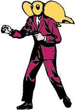
10) Justice League Annual #1 (1987)

It became a running joke to refer to "Natural Form" Martians as looking like Gumby, which I never saw myself. I figure it actually started here, with J'Onn pulling that Mr. Bill "oh, noooo" face. You can tell the aggressors are the JLI by this expression, but it's too silly to register as threatening and the scenario could have probably used more ambiguity. Still, it's a sound concept, and that fuschia sucks on your eyeballs.
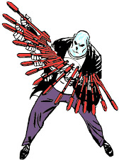
9) Justice League of America #256 (November, 1986)

There is a lot of repetition on this list, including artists and concepts. Here are two burning Martians in a row. I kind of prefer this to the next one, but it serves to break up two Luke McDonnell's in a row. Also, this is more a triumph of coloring
than concept, which when viewed in black and white just seems like a cheating of background. Still, it's a nice solo cover that emphasizes the character's chief vulnerability.
8) Martian Manhunter #1 (May, 1988)

The only cover from the '80s mini-series to make the list. While Mark Badger's artwork has its defenders, fans in general responded poorly to it, and it most likely hurt the perception of the character's commercial viability. Still, this is a potent image that gained traction in the brain thanks in part to house ads.
7) Justice League of America #248 (March, 1986)

The first of two consecutive John Jones covers. This one works so perfectly as a set-up for the entire Manhunter from Mars premise that it would have been an excellent layout for a debut issue. However, it was drawn by Luke McDonnell, whose style flattens everything and reminds the brain that this is a two-dimensional drawing. Imagine Tom Mandrake inking this instead, and it'd rank much higher.
6) Secret Origins[of the World's Greatest Super-Heroes] trade paperback (1989)

I owned this book, and love the cover much, but I wish Martian Manhunter had a more prominent placement. I especially like the slender J'onzz with a strong brow and ominous bearing. It doesn't work as well for John Jones, who could easily be mistaken for the Phantom Stranger. Still, the image perfectly conveys the concept, and the contrast between the monochrome and full cover is intense. I'd hang this on my wall.
5) Justice League of America #178 (May, 1980)

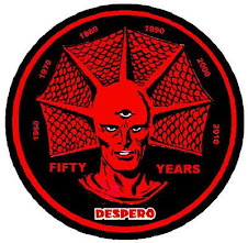
Last cover was by Bolland, Chuck Patton is up ahead, and this is Jim Starlin. Get used to that pattern. Starlin was my first favorite artist-- the first style I recognized and actively collected. This is a great play on the first JLofA cover, with a dynamic restaging that accounts for the whole team, but highlights my favorite. Starlin's even using that extra-detailed "renaissance" style from after he spent too long looking at Bernie Wrightson's Frankenstein portfolio and weeping. I'm so glad Starlin drew Despero at least once, even if it hurts my heart to find Dick Dillin inside.
4) Animal Man #9 (March, 1989)

Another Brian Bolland cover, because Bolland has made an entire career out of pretty much just doing covers, and each is a work of fine art. This is a silly set-up for a serio-comic issue that remains one of the best Martian Manhunter guest appearances. The image is hurt by Bolland opting for a more burly, almost Wayne Boring look, when he's much better at doing a leaner take.
3) Justice League of America #228 (July, 1984)

You know who doesn't get punched enough? Aquaman. People always think he's going to be nice and cool because he used to smile a lot and appear on cartoons with the seahorse and walrus. Instead, Aquaman is the Sub-Mariner of passive aggression. J'onn's all "we have so much in common as #6 and #7 in the JLA, even though Superman and Batman totally strung us along for months before finally deigning to join." Then Aquaman's all like, "Whatever, my fake hand is made of napalm. Burn. Now help me psychically violate a sentient meteor. Okay, you can go now. I'm way more famous than you." I think J'onn still had a bit of precognition from the Silver Age left, and gave him that preemptive love tap for forming the Detroit League.
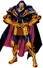
2) DC Comics Presents #28 (December, 1980)

Jim Starlin simply has not drawn the Martian Manhunter enough over his career, and I must protest. Starlin's pretty much made a career out of creating characters that look like the Alien Atlas and/or Darkseid, including a virtual twin, and he does it so well. Sure, J'onn's getting jobbed on the cover, but he's rarely looked so good doing it in front of such impressive company. From the backdrop to the bold logos to that golden monkey mug of Mongul making its debut (in an issue with a Congorilla back-up, appropriately) to Superman shouting "NO!" like Mongul drove up in a van offering candy, everything here says "epic." As an added bonus, Superman's posture and anatomy look kind of ridiculous, so my eyes always travel to the better subject.
1) Justice League of America #230 (September, 1984)

This may have been the first image of the Martian Manhunter I ever saw, as it was featured amidst a collage of covers in a double page spread house advertisement. It's an exceptionally well drawn, on-model, licensing friendly rendition of the Martian Manhunter in bloody combat with a major enemy created specifically for him featured in a story that impacted heavily upon continuity. Coupled with all those head shots of his teammates looking on, you'll scarcely find a more pronounced spotlight for J'onn J'onzz being the baddest Manhunter in the Martian valley. All hail Chuck Patton and Dick Giordano!
Their Top Covers of the 1980s
- The Atom @ Power of the Atom
- Doom Patrol @ DC Bloodlines
- Wonder Woman @ Diana Prince is the New Wonder Woman
- Aquaman @ Justice League Detroit
- DC75: Top Character Covers of the Dodranscentennial


5 comments:
Interesting choices, Frank! I really like the Secret Origins cover.
In some Stormwatch news from Comic Book Resources, there is a preview of issue # 4 at http://www.comicbookresources.com/?page=preview&id=10677 . Additionally, In BIGGER news, Paul Cornell is leaving Stormwatch and will be replaced by Paul Jenkins. Details at http://www.comicbookresources.com/?page=article&id=35794
You are my official line to CBR goings-on, Will! However, I got the news elsewhere, and will link up with commentary in tonight's post...
I want the cover of Secret Origins as a poster SO badly, but, alas, in all the years I've been looking I've never been able to find one. I think it's brilliant from the composition to the 50's decor, and I rather like "John Jones" sitting in the background taking things in, though I can see how he'd be mistaken for the Phantom Stranger. It's too bad that trenchcoat didn't stick around (or a secret identity in general), because what a great noir visual that is.
And since it's the cover to a trade, it won't fit in my comics display frame. Shame.
Cornell's leaving already?! Oh, I can't keep up with this! I wonder what prompted that.
Frank, I commented on the preview a day or so back at CBR and thought to mention it today -- then I saw the big news. I just hope that the characters of Stormwatch and J'Onn J'Onzz are treated well by Jenkins or whoever takes over the book in the long run.
I am looking forward to your post tonight -- and I will link to it at CBR.
"I want the cover of Secret Origins as a poster SO badly"
Surely one of these print-to-order places could hook you up. I was at Walgreens the other day, and their print lab seems to be largely automated these days, so you could probably skirt copyright restrictions there.
Will, as you saw, my comments were more of a tacked-on whimper than a bang. :)
Post a Comment