

First things first, it's "Lot Fee." Based on my internet searches, I am not alone in mistaking it for "Lofty" in spelling and pronunciation, but you get much better search results with the correct name. He's also completely unaffiliated with Britney Spears, so you know.
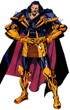
Sam Lotfi parlayed his slacking in school doing doodles into a career in cartoons with Powerhouse Animation, as well as comic book work. I familiarized myself with his efforts when he was announced to attend Comicpalooza 2012, but I blew through so much money so fast that year, by the time I reached his table I couldn't afford to pay for a commission. I spent the following year kicking myself, because Lotfi has an excellent mid-century illustrative style that I'm smitten with, and he's very mindful of cinematic compositions. I especially like how he does hulking, foreboding figures, so he was an obvious choice for TOR, the Robot Criminal of Mars.

TOR was one of the Manhunter from Mars' earliest superhuman opponents, and had a history with J'onn J'onzz revealed in flashback. He's exceptionally powerful for an old school rogue, and just all around nifty, which is why folks around here seem to like the guy. Unfortunately, he was never drawn full figure in his one comic book appearance, and only appeared in his true form for 1⅓ pages before sending his mind into a human surrogate for the rest of the tale. Getting a compete look at the character for the first time in fifty-six years was practically a public service!
Clarity was the name of the game, which kind of tied Lotfi's hands with regard to his posing of the figure, but I think he pulled it off beautifully! While still very boxy and utilitarian in that Frigidaire way, TOR is also robust and solemn like a golem from folklore. It strikes just the right balance between quaintly retro and intimidating, conveying a lot of personality with its precise posture. The character is state of an outdated scientific art, simultaneously polished and coarse, which the blue pencil shading captures well. I dig the little "TOR" at the corner, the attention to period detail-- just everything. What a swell commission!

The piece was produced on 11" x 14" bristol board within a few hours for $75, marking it as one of only three commissions I got to take home on the first day of Comicpalooza and a favorite of the convention as a whole. I believe Lotfi is still taking commissions per his deviantART page, or maybe hit him up on Facebook. I recommend taking up the offer, but scope his blog if you need more fantastic work to sway you. I'm very pleased Lofti came back this year to provide this awesome illustration (which I'm totally turning into a sidebar icon as well,) and I hope to make collecting his work an annual occasion.


1 comment:
I like it! Very clean, simple, and very efficient lines. There's a bit of the Silver Age in his style, too.
Post a Comment