

MARTIAN MANHUNTER
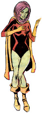
"The big gun of Stormwatch. The goal was to create a warrior look for the Martian Manhunter-- he's a bad dude-- but at the same time make him somewhat regal looking. He's not a brawler; he's a master strategist. DC co-publisher Jim Lee stepped up to lock down the final design... The sides of Manhunter's head proved tricky for artists when this new design was first being incorporated. The raised forehead yet slightly sunken, ridged sides took some practice before it became second nature to draw."
 The New 52 has proven a solid jumping off point for me as a devoted DC reader, although the truth is that I've been steadily losing interest across a decade, and should have probably quit them between the Crises Identity and Infinite. I came in with Jenette Kahn, Dick Giordano and Paul Levitz, whose aesthetic is simply not compatible with that of Dan DiDio, Geoff Johns and Jim Lee. That said, I remain excited by the potential of the New 52 Martian Manhunter, who despite recently leaving Stormwatch remains a pivotal figure in the integration of the Wildstorm properties into a merged DC Universe. I'm more excited about Helspont as a Superman villain than I ever was in his days as the Magneto of the WildC.A.T.s, and it's great fun to feel the fresh synergy of Daemonites roaming in a shared history with Mars. After a year's worth of revised, mysterious continuity and some hindsight, I've come to appreciate J'Onn J'Onzz being freed from the shackles of staid establishment. He's not a Justice League founder anymore-- and he may have betrayed them as an early recruit! Is the Blue Flame that empowers Helspont the same as the one that destroyed Mars in the Bronze Age? If Martian Manhunter wasn't tied down to every incarnation of the JLA, what has he been getting up to with his clandestine operations? Might we finally get an Alien Atlas built up to stand as a solo hero again, with creators actually looking into his rogues gallery instead of inventing redundant retcon lame-os?
Click To Enlarge
The New 52 has proven a solid jumping off point for me as a devoted DC reader, although the truth is that I've been steadily losing interest across a decade, and should have probably quit them between the Crises Identity and Infinite. I came in with Jenette Kahn, Dick Giordano and Paul Levitz, whose aesthetic is simply not compatible with that of Dan DiDio, Geoff Johns and Jim Lee. That said, I remain excited by the potential of the New 52 Martian Manhunter, who despite recently leaving Stormwatch remains a pivotal figure in the integration of the Wildstorm properties into a merged DC Universe. I'm more excited about Helspont as a Superman villain than I ever was in his days as the Magneto of the WildC.A.T.s, and it's great fun to feel the fresh synergy of Daemonites roaming in a shared history with Mars. After a year's worth of revised, mysterious continuity and some hindsight, I've come to appreciate J'Onn J'Onzz being freed from the shackles of staid establishment. He's not a Justice League founder anymore-- and he may have betrayed them as an early recruit! Is the Blue Flame that empowers Helspont the same as the one that destroyed Mars in the Bronze Age? If Martian Manhunter wasn't tied down to every incarnation of the JLA, what has he been getting up to with his clandestine operations? Might we finally get an Alien Atlas built up to stand as a solo hero again, with creators actually looking into his rogues gallery instead of inventing redundant retcon lame-os?
Click To Enlarge
Another major step forward in my book was the redesign of the Manhunter from Mars. I have much love for J'Onn J'Onzz, but I've always tried to view him with a critical eye and recognize his failings. Let's be honest, no thought went into his original costume, and it was about as generic as Martian gear gets. Chest straps, a belt, trunks, boots, cape. Tweaks were made over the years, my favorite being the raised, folded collar on his cape, but he might as well have been a low rent luchador if not for the brow and green skin. Over time, the simplicity of the suit gave it a nostalgic appeal, but the uninitiated would be forgiven for assuming that J'Onzz was simply a variation on the Hulk (as I've learned from experience.) As much as I want to hold on to the old J'Onn I bought as a Super Powers figure back in 1985, his look has held him back for decades. Visually, there was nothing about him that said "the Sleuth from Outer Space," or much of anything besides "retro extraterrestrial." Click To Enlarge

I've been frustrated for over a year with DC releasing design sketches for New 52 heroes on their blog, many with only minor tweaks, but skipped the fairly radical Martian Manhunter revision entirely. Yeah, I'm sure Apollo and Midnighter were worth way more web traffic. It's not like their every solo comic combined amounts to fewer issues than the 1998 Martian Manhunter series alone. Thanks to DC's irritating oversight, like sand in my eyelid, I had to wait until the trade paperback collection Stormwatch Vol. 1: The Dark Side was released in late May to finally see the above images. I bought the comics as floppies, so between the wait and their not being very good, I was pissed off enough not to bother buying it. I've waited for months to see if a scan would turn up online, and finally found some at The Art of Jim Lee tumblr and Character Model.
Click To Enlarge

I liked Apollo's new outfit, as I found the old one about as dull as any super-hero who ever existed, so the only direction was up. Midnighter's is-- well-- comically inept. Jenny Quantum and Jack Hawksmoor were given modest positive alterations, while the Engineer seems to have been left alone. All were by Cully Hamner, who I've erroneously been crediting for the new look Martian Manhunter. No one has yet to draw J'Onn's more alien head as well as Hamner, but the two designs he turned in for the Alien Atlas leave a lot to be desired. The first one kept J'Onn's red "x" chest straps, which I have long felt are too common amongst prominent DC heroes (Hawkman and Adam Strange come readily to mind.) I hate when the "x" is used as an icon for the Manhunter, and I'm happy to see it ultimately excised. However, aside from the "x," nothing in that first design says "Martian Manhunter" except the guy wearing it. The flap on the cape kind of alludes to his old collar, but the degree of skin exposure around the neck better recalls Superman. The reverse teardrop cape serves even less purpose than a normal cape, is effeminate, and just plain embarrassing. The random techie crap on the chest is dated and dumb, the plunging "v" neck pities the fool, and the artist seemed to lose interest from the waist down. Piping is to 2012 as multiple bootstraps were to 1994. Click To Enlarge

Hamner's revised attempt looks like a swell N'or Cott update, but what about this tells you it's meant for the premier Martian super-hero? Remember in the '90s when you'd get a costume redesign for a story, and then Toy Biz would turn it into Arctic Gear Batman™ or Stealth Armor Iron Man®? This looks like that action figure variant, except dressed down, like he comes with a vehicle or snap-on extras. Besides a souvenir novelty-sized Blood Gem and boots that vaguely resemble cavalier stock, there's nothing Martian Manhunter here. That is, unless he's going undercover as Johnny Utah to prove that the Ex-Presidents are, in fact, surfers.
Click To Enlarge

I typically like Hamner's work, and the final Martian Manhunter design seemed keyed in to his sensibilities. Imagine my surprise when it turned out to be Jim Lee, who I feel is one of the worst, most creatively bankrupt designers in comics. Lee was really inspired here though, and deserves kudos. As much as I miss the collar, the skin tight yet angular cape is slick. The bottom straps of the old chest piece remain intact, but the upper portion is a unique horizontal plateau. The eight sided "pie" belt buckle dating back to the oldest comics is elevated to emblem status, which frankly warms my heart, since it was also present on my Super Powers figure. In order for it to stand out from a Plain Jane black and white image any schoolchild could draw in seconds, the "slices" are rendered gray and the slits a luminescent red, oddly complimentary. In an intriguing blending of cultures, an Eastern style breechcloth covers a pants/boot combo once worn by Cossacks, giving an added exotic effect to the alien's otherworldliness. While the seashell temples and insectoid forearm plates have that stink of cheap television sci-fi and video games, they also serve to separate the Martian Manhunter visually from the Hulk, which is a good thing in moderation. As previously noted, application of those physical affectations has been inconsistent, and the great thing about a shapeshifter is that it leaves a lot of the presentation up to the artist's prerogative. They can go for handsome humanoid or creepy creature as desired, and that flexibility should lend them enthusiasm, always preferable if you want good work.

Other elements have been up for grabs. Miguel Sepulveda drew the chest symbol as an Atom atom, which I could have done without, and the dhoti has contained a variety of designs. Sometimes the suit is colored bright purple, which is a bit loud but contrasts perfectly against green skin. Other times, the purple is so dark as to turn blue, and often is a dark blue at that, which is more familiar and preferable to me. The new get-up doesn't have much "Sleuth from Outer Space" in it, but as a battle suit for cosmic conflicts, I think it's aces. There's also room to play, since the new Martian Manhunter seems geared toward a more multifaceted presentation. I like this track, and hope DC has more in store for J'Onn J'Onzz...


10 comments:
Frank, thanks for posting the article.
I think that J'Onn's new costume is the best of the lot for the new Stormwatch, while Midnighter looks like he must have been at a garage sale for someone who was an extra in one of the Road Warrior movies.
J'Onn's costume now has a sense of the exotic. It is more of a warrior's outfit than a detective's outfit, but J'Onn can change forms so maybe a more stealth look might be possible. I do like this outfit better than the one with the reverse tear drop cape.
As for J'Onn, so far he has show that he can stand against some heavy hitters -- including the much vaunted (and rather bland) Justice League. I imagine that J'Onn is probably ready for conflicts with them, so I would not be shocked if he has a pocket full of Kryptonite.
Ahhh! Spin Doctors reference! Noooo!
Frank, I do have a love of puns. Also, the subject was fashion.
However, considering how many times editors have made J'Onn a jobber for the Man of Steel and the fact that this version of J'Onn seems to be a strategist, I think the Last Son of Ma'aleca'andra may be prepared for the Last Son of Krypton. (Somehow, i think J'Onn knows that his next meeting with the Justice League will not be an easy one.)
I'm just glad that they went with the Jim Lee design the others are just weird looking. Don't like the face and weird nose of the others. His new outfit has a more noble look about it.
You know, as much as I don't like the bumps on the cross straps of Hamner's design, I really, really like the cape. I don't know what it is. (Maybe just the purple.) I think the teardrop shape is kind of different (if impractical) and the collar is still there. I also like the shoes/boots with the piping. Maybe it's a girl thing. Also I like how the leggings are more like pants. Kind of a business suit vibe going there that I really like. I do like how he was playing with colors...I remember wanting a purple Martian Manhunter cape at one time.
I don't like the last design. Even though it sports a cool design, the loincloth is too tribal and too "warrior." I think it makes J'onn look more like a physical hero, when I think his intelligence and unique sensibilities are what set him apart. It's just too busy and too clunky for me, and I just can't get used to no collar. And I'm a fan of the cross-straps. (Adam Strange doesn't have them anymore, which makes me very sad, or maybe he does, I don't even know what happened to Adam Strange at this point.)
If you could put the pie symbol on Hamner's design and nix the temple and nose ridges, I would really like it.
Will, a Superman takedown would be soooo sweet, especially if brains trumped brawn (although a little brawn on both sides would be nice.)
aota, I kind of like the nose. The jowls and chin, not so much. J'Onn also needs visible eyes, because he's meant to be expressive.
Liss, I could be swayed on everything about the Hamner cape except the reverse teardrop. Way too Manhunter On Ice for me to tolerate. As for the loincloth, I think it makes him look more reserved and dignified, because who could fight in that thing? He needed a bit of flair down there. But yes, let's drop the old collar onto the new cape eventually...
Great find!
The initial (caped) design is interesting, but I agree the cape just doesn't cut it for visual fare. The suit in general has a ST:TNG vibe, especially the boots. Hamner's redesign of the head is pretty interesting, if more of a departure than would be to my tastes.
His second design I could like as a member of the actual authority. functional, cool enough, but not terribly superheroic. I think it's rejection was due to the fact that DC was adopting the authority, not the other way around.
Lee's is easily my favorite costume design of his, and gives that warrior priest vibe I love to see on J'onn. You make a point about the "Sleuth" aspect being missing, but then again, how present has it ever been? Especially in this modern era, the Detective has taken on a rather mundane look, and J'onn's fighting togs are for fighting monsters from outside time; When he's hunting leads, it's inconspicuous suit and coat all the way.
What I really want to see is a simple, elegant design. The loincloth is pretty busy, and there's a lot going on all over with that costume. J'onn is a rather pedestrian sort of hero, so his costume should not be the first thing one notices about him. Like m.c. said, a simple suit and coat suffices for being inconspicuous. Why shouldn't his superhero duds be any less inconspicuous?
Add to that, will we ever know if this costume is part of his body, or is it some kind of Martian intelligent clothing like M'gann wears on Young Justice? (Not that it really matters, but it's good to have editors who think about those kinds of details.)
"The suit in general has a ST:TNG vibe, especially the boots." THAT'S why I like the boots. Now it all makes sense. Thanks, m.c.
M.C., the old cape on this costume would work fine, and the purple shift would make it even more of an old brown trenchcoat proxy to visually call back to the detective genre. Thrown back: Superhero. Draped: Dick, and all those busy colorful elements Liss dislikes go away without going the full chameleon route.
I've always thought of the collar as more regal than mysterious... I guess it is in keeping with a turned up collar on a Sam Spade...
Post a Comment